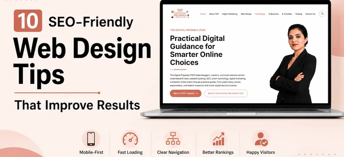
A website does not need flashy animations or complicated layouts to succeed. In fact, some of the best-performing websites look surprisingly simple. What sets them apart is how easily visitors can find information, navigate pages, and take action without feeling lost or frustrated.
Many website owners focus heavily on aesthetics while missing the experience behind the design. As a result, their websites may look attractive but fail to guide people properly. After Google’s recent updates, helpful pages, clear structure, and real user satisfaction matter even more. So, these SEO-friendly web design tips focus on practical changes that enhance comfort, build trust, and long-term visibility.
Tip 1: Design for Mobile Users First
Most website visits now happen on smartphones. Yet many websites still feel like desktop designs squeezed onto smaller screens. This creates friction immediately because readers expect a smooth, readable, and comfortable mobile experience.
Whenever I review websites, one of the first things I check is how the design performs on a phone. If text feels cramped, buttons are difficult to tap, or images push content out of place, users often leave before exploring further.
A mobile-first approach encourages cleaner layouts and better prioritization of information. As a result, visitors can find what they need faster.
Businesses exploring flexible design approaches may find useful insights in this guide on Liquid Web Design, which explains how adaptable layouts improve usability across devices.
Mobile Design Priorities
- Use readable font sizes throughout the website. People should never need to zoom in to read important information.
- Keep buttons large enough for comfortable tapping. Small buttons often create frustration and accidental clicks.
- Test pages on different screen sizes regularly. A design that works on one phone may break on another.
- Remove unnecessary visual elements on mobile. Cleaner layouts usually create a better browsing experience.
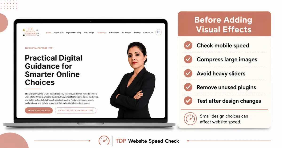
Tip 2: Improve Website Speed Before Adding Visual Effects
Many website owners add sliders, animations, popups, and heavy graphics to make the website feel modern. However, visitors usually judge the experience before they notice those details.
A slow page can quietly damage trust. When someone clicks from Google and waits too long, they may return to search results without reading your content.
Before adding any visual effect, ask one simple question:
“Does this help the visitor understand, trust, or act faster?”
If the answer feels unclear, the feature may not belong on the page.
When I review small business websites, I often notice that speed problems start with small design choices. Oversized images, extra plugins, sliders, and heavy animations can quietly slow down a page. That is why I prefer checking speed before adding new visual effects.
Before adding sliders, heavy animations, or large visuals, check web.dev’s website performance guidance to understand how design choices can affect loading speed.
Speed Improvements Worth Prioritizing
- Compress every image before uploading it. Large images can slow down even a well-designed page.
- Use fewer animations on important pages. Movement should guide attention, not distract users.
- Remove plugins you no longer use. Extra tools can add hidden weight to your website.
- Check page speed after every major design change. A beautiful update should not make the website slower.
Tip 3: Create Navigation That Feels Natural
Readers should understand your website structure within seconds.
However, many websites create confusion through complicated menus, creative labels, and overcrowded navigation bars. Instead of helping visitors, these elements often make it harder to find information.
Simple navigation performs better because it reduces decision fatigue. When users know exactly where to click, they spend less time searching and more time engaging with your content.
Another effective strategy involves grouping related content into clear categories. This approach benefits both people and search engines.
Readers interested in broader website design strategies can explore the Web Design category for additional ideas and practical guidance.
Navigation Best Practices
- Use menu labels that clearly describe page content. Clarity always beats creativity.
- Keep the primary navigation simple. Too many choices can overwhelm website users.
- Maintain consistent navigation across all pages. Familiarity improves usability.
- Help visitors reach important pages quickly. Fewer clicks often create a better experience.
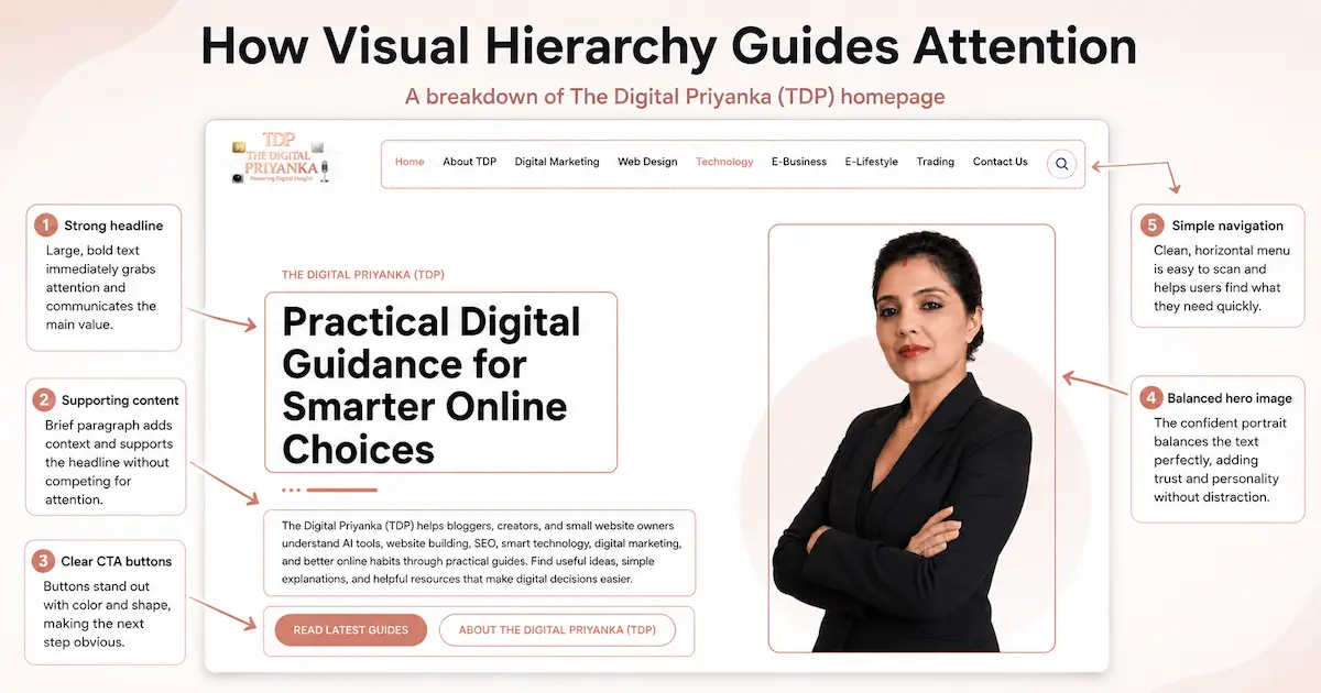
Tip 4: Use Visual Hierarchy to Guide Attention
Every page should direct readers toward important information.
Without visual hierarchy, everything competes for attention. As a result, users may struggle to understand what matters most.
Strong headlines, strategic spacing, and logical content flow all contribute to better visual hierarchy. These elements help website users process information more efficiently.
One mistake I often notice is trying to fit too much content above the fold. Instead, focus on presenting the most important information first and allow the page to guide visitors naturally.
Modern design trends continue to evolve. For example, this article on Why 3D Website Design Elevates Digital Experiences shows how immersive visuals can attract attention when used thoughtfully.
Ways to Improve Visual Hierarchy
- Use one clear primary headline per page. People should immediately understand the page purpose.
- Break content into logical sections. This makes information easier to absorb.
- Use white space intentionally. Proper spacing improves readability significantly.
- Highlight key actions naturally. Readers should always know what to do next.
Tip 5: Make Content Easy to Scan
Most visitors scan before they read.
This behavior means content structure matters just as much as content quality. Even valuable information can go unnoticed if it appears in large blocks of text.
When creating content, think about how someone experiences the page during the first few seconds. Can they identify the main topic? Can they find answers quickly?
Short paragraphs, descriptive headings, and strategic formatting all improve readability. They encourage people to stay on the page longer.
Research from Nielsen Norman Group consistently highlights how users scan content before deciding whether it deserves deeper attention.
If you are building a new website, this guide on How to Build a Small Business Website Without Coding provides useful planning tips that support both design and content organization.
Content Formatting Tips
- Keep paragraphs short and focused. Smaller text blocks feel easier to read.
- Use descriptive subheadings throughout the page. They help website users locate information quickly.
- Include bullet points where appropriate. Lists improve scanning and comprehension.
- Remove unnecessary filler content. Every section should provide genuine value.
Tip 6: Optimize Images Without Losing Quality
Images can make a website feel polished, helpful, and visually engaging. However, they can also slow down your pages if you upload them without checking size, format, and placement.
One common mistake is uploading large images directly from Canva, Photoshop, or stock photo websites. The image may look beautiful, yet the file size can quietly damage page speed.
I follow the same process for my own website images. Before uploading them to WordPress, I usually check the file size in Squoosh and compress them to a lighter format. This helps reduce image weight without making the visuals look dull or blurry. I find this especially useful for blog images, feature images, and homepage visuals because they can quietly affect loading speed.
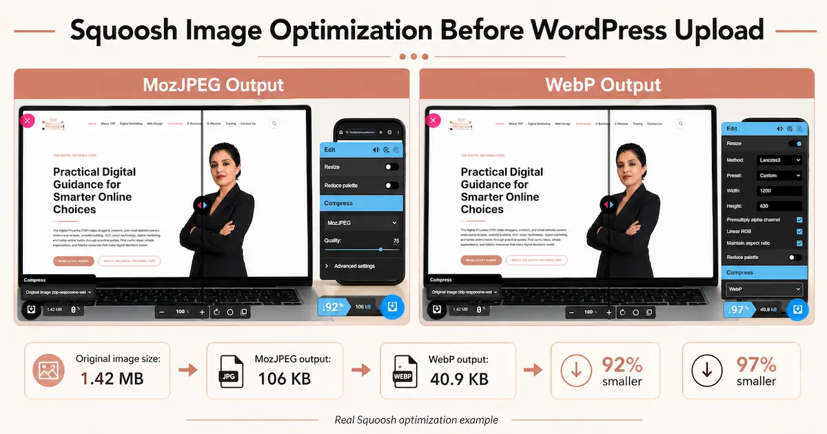
Before uploading any image, resize it according to where it will appear. Then convert it into a lighter format when possible. The Google WebP guide explains how WebP can reduce image size while keeping visual quality strong.
Image Optimization Tips
- Use WebP format for blog and website images. It can reduce file size while keeping visuals clean and sharp.
- Rename image files before uploading them. A descriptive file name also keeps your media library easier to manage.
- Add natural alt text to important visuals. Write it for readers first, then include the topic where it fits.
- Avoid placing important information only inside images. Search engines and screen readers understand written page text better.
Tip 7: Build Trust Through Better Design Details
Visitors start forming opinions within seconds. They notice spacing, colors, layout, contact details, page freshness, and readability before they decide whether to trust the content.
A website does not need to look expensive to feel trustworthy. However, it should feel clean, updated, easy to use, and consistent from page to page.
Trust also connects with accessibility. A website should feel comfortable for different users, devices, and browsing needs. The W3C Web Accessibility Initiative shares useful guidance for building websites that more people can use easily.
Trust Building Design Tips
- Add clear author details where possible. Readers feel more confident when they know who created the content.
- Keep your branding consistent across pages. Fonts, colors, buttons, and spacing should feel connected.
- Fix broken links and outdated sections regularly. Small errors can make a website feel neglected.
- Keep contact details easy to find. Readers should not struggle to understand how to reach you.
Tip 8: Use Internal Links to Guide Readers Naturally
Internal links should feel like helpful directions, not SEO decorations. They should move readers from one useful idea to the next without breaking the flow.
For example, someone reading about design tips may also want tools that simplify website creation. In that case, linking to Free AI Website Builders feels helpful because it supports the reader’s next step.
Similarly, a small business owner may want tools for writing, planning, design, or productivity. That is where Best Free AI Tools for Small Business Owners can add value without distracting from the main topic.
Internal Linking Tips
- Link only where the next page genuinely helps the reader. Relevance matters far more than link count.
- Use clear anchor text that explains the linked page. Readers should know what they will get before clicking.
- Connect related topics within the same category. This strengthens the reading flow and topical clarity.
- Avoid stuffing multiple links into one paragraph. Too many links can interrupt the user experience.
Tip 9: Reduce Friction on Important Pages
Some pages carry more responsibility than others. Contact pages, service pages, landing pages, pricing pages, and lead forms should feel simple and focused.
If visitors reach an important page and feel confused, they may leave without taking action.
One common issue is asking for too much information in forms. Another is placing too many buttons on the same page. When every element asks for attention, readers struggle to decide what to do next.
Good design reduces effort. It helps people complete a task without unnecessary steps. The Interaction Design Foundation shares many helpful UX ideas around user behavior, clarity, and friction.
Friction-Reducing Tips
- Keep forms short and simple. Ask only for the information you truly need.
- Use one main call to action on important pages. Too many choices can confuse people.
- Place key information before the action button. Website users should understand the value before they click.
- Test important pages as a real user. This helps you notice small issues you may usually ignore.
Tip 10: Keep Improving Your Website Over Time
A website should never stay untouched for months. After Google’s May 2026 core update, small websites need to pay closer attention to helpful content, clear structure, mobile usability, and real user satisfaction.
Design trends change. Reader expectations shift. Search behavior also changes with time. Small regular improvements often work better than one large redesign after years of neglect.
For TDP, website reviews work best when speed, mobile layout, broken links, and old content are checked together. One small design issue may not look serious alone, but several small issues can quietly reduce trust.
Review your website every few months. Check mobile experience, page speed, broken links, outdated content, image size, and navigation flow. These checks may look simple, but they often reveal problems people face without saying anything.
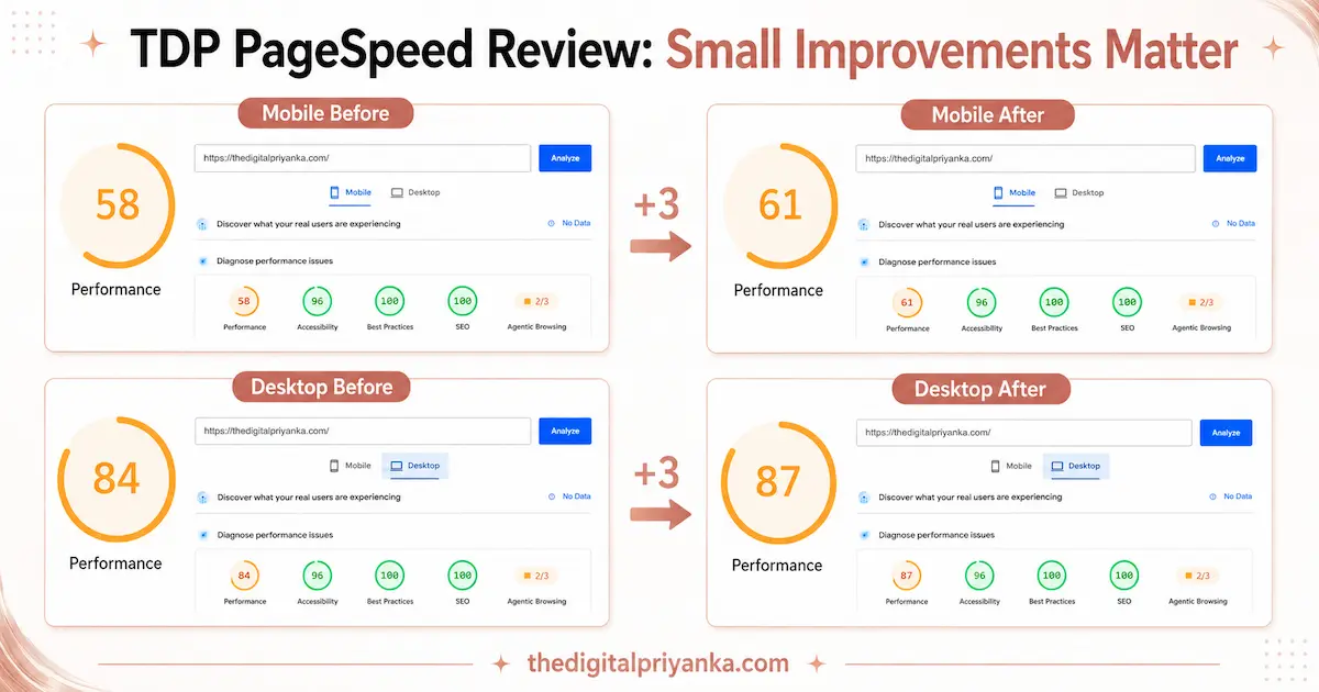
While reviewing TDP’s homepage, I noticed a small PageSpeed improvement after checking image size, layout weight, and basic performance issues. The mobile score moved from 58 to 61, while the desktop score improved from 84 to 87. These small changes may look minor, but regular reviews help spot speed, layout, and user-experience issues before they become bigger problems.
Website Review Tips
- Check your most visited pages first. These pages influence your website experience the most.
- Update old content when information changes. Fresh and accurate pages build stronger trust.
- Review analytics to find weak pages. High exits may show design, speed, or content problems.
- Ask someone else to test your website. Fresh eyes often catch issues you may miss.
Final Thoughts
Good web design should make people feel comfortable from the moment they land on your website. They should understand where they are, what they can learn, and what to do next without confusion.
These SEO-friendly web design tips are not about shortcuts. They are about building a website that feels useful, fast, clear, and trustworthy. Mobile-first layouts, simple navigation, readable content, optimized images, helpful links, and regular updates all work together.
The best websites respect the reader’s time. They do not make people search too hard, wait too long, or feel unsure. When your website feels easy to use, readers stay longer, trust more, and slowly, that stronger experience can support better results.
Frequently Asked Questions
1. What are SEO-friendly web design tips?
SEO-friendly web design tips are practical improvements that make a website easier to use and easier for search engines to understand. They include mobile usability, speed, navigation, content structure, image optimization, and trust signals.
2. Why does web design matter for SEO?
Web design matters because it shapes how people use your website. Slow, confusing, or hard-to-read pages can push users away, while better design supports engagement and trust.
3. What is the first thing to improve in web design?
Start with mobile usability. If your website does not work well on phones, many users will struggle. After that, focus on page speed, navigation, and content readability.
4. How can I make my website easier to read?
Use short paragraphs, clear headings, bullet points, proper spacing, and readable fonts. Also, remove filler content so readers can find useful information quickly.
5. Are images important for web design?
Yes, images help explain ideas and make pages more engaging. However, they should be compressed, relevant, and placed near related content so they improve the experience.
6. How do internal links improve user experience?
Internal links guide readers to related content without making them search manually. They help readers continue learning and also show how different website topics connect.
7. Should I use animations on my website?
Animations can work well when they support the user experience. However, too many effects can slow the website and distract website users, so use them carefully.
8. What makes a website look trustworthy?
Clear branding, readable content, updated pages, working links, visible contact details, and consistent design all help a website feel trustworthy to visitors.
9. How often should I review my website design?
Review important pages every few months. Also, check them after theme updates, plugin changes, traffic drops, or major content edits.
10. What is the best SEO-friendly web design tip?
The best tip is to design for real users first. When your website is fast, clear, useful, and easy to navigate, it naturally supports better engagement and stronger visibility.