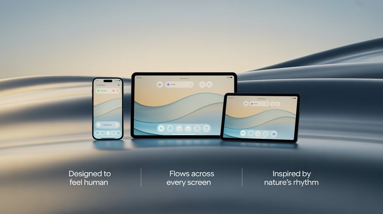
Open a few tabs today, and the screens almost seem to be breathing. Corners soften into curves, sections melt into one another, and colour seems to glide across the page instead of sitting still. Even on small phones, layouts feel smoother than they did a few years ago.
That change reflects a shift toward liquid web design 2026. Designers combine flexible grids, organic shapes, soft gradients, and meaningful motion, ensuring that every screen size feels natural, calm, and easy to read. The goal stays simple: let visitors navigate through information the way water moves along a path, guided yet never forced.
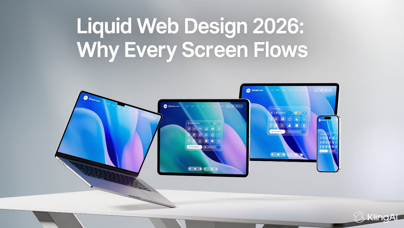
This short visual shows how liquid layouts feel in real interfaces.
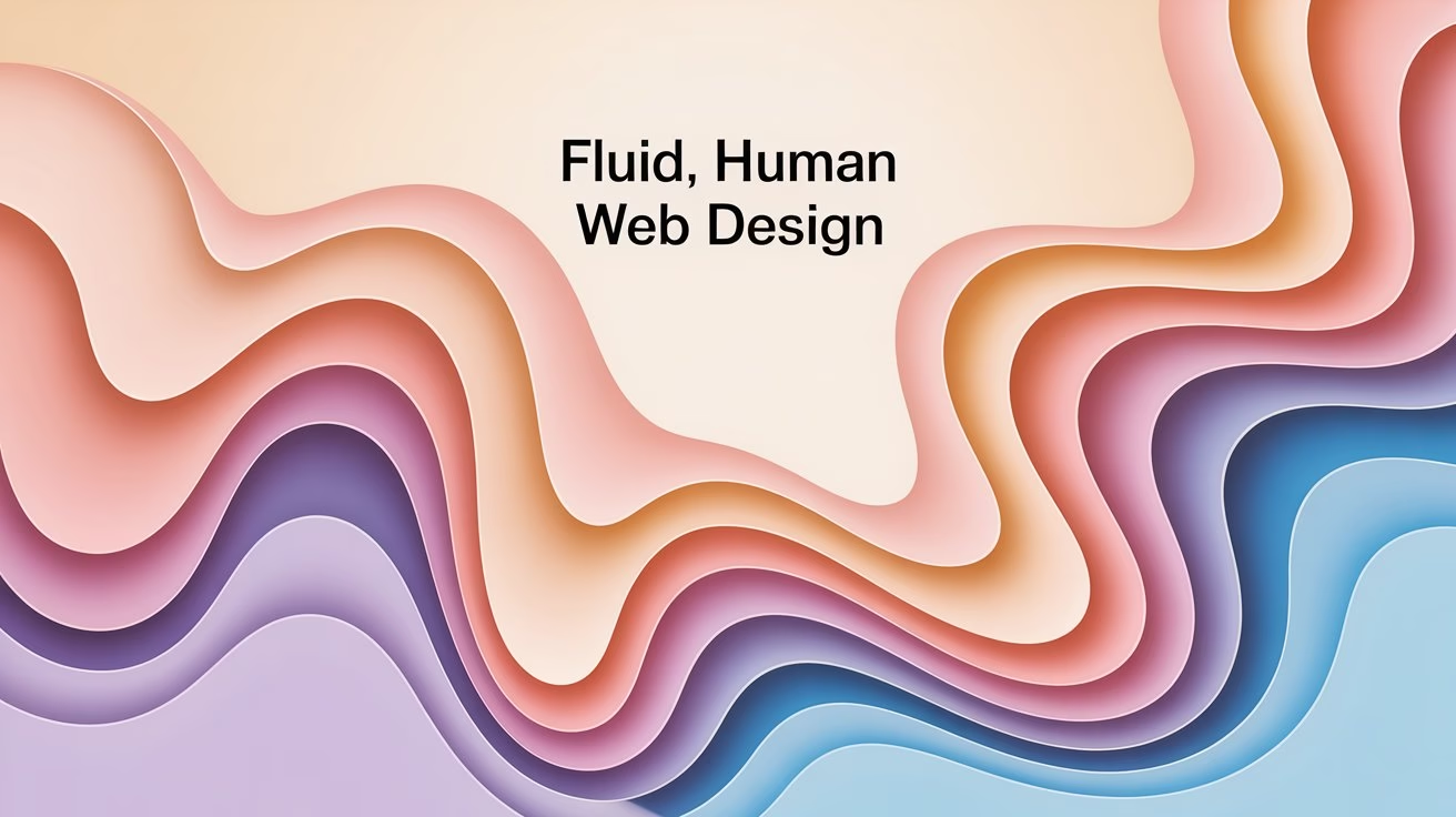
What Does Liquid Web Design 2026 Really Mean?
Earlier, “liquid” meant layouts that expanded and shrank with the browser window instead of clinging to one fixed width. Proportional units and flexible columns allowed content to adapt across screens without breaking, an idea explained clearly in MDN’s responsive design guide.
In 2026, liquid design covers structure and emotion together. Layouts still depend on fluid grids, yet they now favour soft shapes, depth, and motion that feels more like a living surface than a printed page. Guides such as web.dev’s responsive web design basics show how flexible grids, relative units, and media queries work together to support this kind of adaptable interface.
Liquid thinking shows up clearly when layouts stretch smoothly, shapes stay rounded rather than harsh, and every animation supports the story rather than acting as a random effect.
Why Flowing Layouts Feel So Natural Now
Daily life already shifts across devices: phones, tablets, laptops, smart rings, and even dashboards in cars. Interfaces that move with the same softness feel less mechanical and more human. Trend roundups on modern web design patterns highlight organic forms, flowing lines, and softer gradients as an answer to rigid grids from the previous decade.
This emotional side of design links well with behaviour-focused content, such as Neuromarketing Techniques Marketers Need in 2026. This guide shows how subtle cues steer attention and choices, and flowing visuals align beautifully with those cues.
Liquid layouts feel comfortable because curves echo shapes from nature, motion follows predictable rhythms, and sections open space for the eye to rest. Screens become places to stay rather than panels to escape.
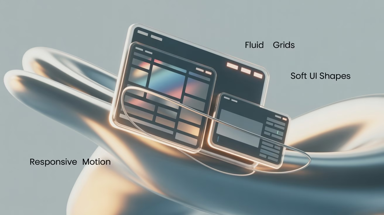
Core Layout Ingredients of a Flowing Site
Under every flowing interface, a disciplined layout keeps everything stable. Tutorials on responsive design from MDN Web Docs and Web.dev’s Learn Responsive Design describe how fluid grids, flexible images, and media queries help pages adapt to countless devices.
- In practice, Liquid Web Design 2026 often uses CSS Grid or Flexbox as a backbone.
- Columns use percentages or fractional units, while container widths stay capped so reading lines remain comfortable.
- Articles comparing fluid, responsive, and adaptive layouts explain how proportional scaling keeps transitions between screen sizes gentle rather than sudden.
- Typography responds similarly. Font sizes and line heights adjust with the viewport while key headings still follow clear limits.
- This balance between fluidity and control helps long guides, tutorials, and explainers remain readable, even when designs start to feel more experimental.
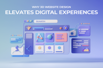
For a richer example of structure with depth, the article on 3D Website Design Experience shows how strong layout decisions support more immersive visuals without confusing visitors.
Visual Techniques That Make Everything Look Fluid
Once the structure feels solid, visuals create the liquid mood. Designers use gradients, translucent panels, blur, and soft shadows so surfaces feel like glass and light rather than flat blocks of colour.
Resources on glassmorphism UI, such as Nielsen Norman Group’s glassmorphism article, describe this style as layered translucency that creates depth between foreground and background elements. Case studies, like Clay’s overview of glassmorphism UI, show how frosted panes and glowing edges can stay clean when used with intention.
Organic shapes and abstract blobs carry equal weight. Trend overviews like Hostinger’s web design trends guide and examples of fluid shapes from Cloudways discuss how wavy forms and anti-grid layouts make interfaces feel more natural.
In real projects, these ideas appear as wavy section dividers, gradient backgrounds that flow from one hue to another, glowing buttons that rise gently on hover, and cards that drift into view. Articles such as EMO Desktop Pet Robot 2025 – Features, Price Explained already show how motion and personality can tell a story; liquid visual techniques simply apply the same energy to layout and interface.
How It Fits into Modern Web Design Trends 2026
Trend roundups from studios and builders keep returning to a similar theme: 2026 favours interfaces that feel human, fluid, and emotionally warm. Articles in places like Smashing Magazine’s web design section point toward softer grids, richer depth, and calmer motion.
Liquid layouts connect strongly with that movement. Instead of dense card grids, pages lean toward generous spacing, sections that flow into each other, and motion that behaves more like a guided walk than a slideshow.
These ideas blend nicely with future-focused content. Articles like Smart Ring Trend 2025: The Next Big Wearable Tech and Hocoos AI Website Builder: Everything You Need to Know show how emerging technology feels more relatable when surrounded by calm, expressive design rather than strict grids that resemble software dashboards.
As more creators adopt liquid web design, visitors gradually expect this kind of visual comfort, even from smaller brands and solo projects.
How to Start Experimenting with Liquid Layouts in 2026
- Liquid aesthetics can look complex at first, yet small experiments already change the feeling of a page. Many guides to fluid and responsive design recommend starting with a single section or page type and extending the style from there.
- One useful strategy treats each core article or landing page as a story scene. A layout for a digital marketing guide can introduce a gentle wave behind the main heading, while a product-focused post might highlight key features on a soft, glass-like card.
- Tools such as Figma, Framer, and modern website builders provide ready-made wave separators, gradient kits, and blob generators. Designers can tweak these assets to match existing brand colours instead of chasing every trend.
- For more technical readers, MDN’s guides on common fluid grid layouts and media queries offer hands-on CSS examples that support experimentation with confidence.
- The key lies in moving gradually: adjust a hero area, refine buttons, then redesign one or two high-impact pages. Over time, the whole site begins to feel more fluid without overwhelming visitors with sudden change.
Quick Checklist: Design One Liquid Hero Section
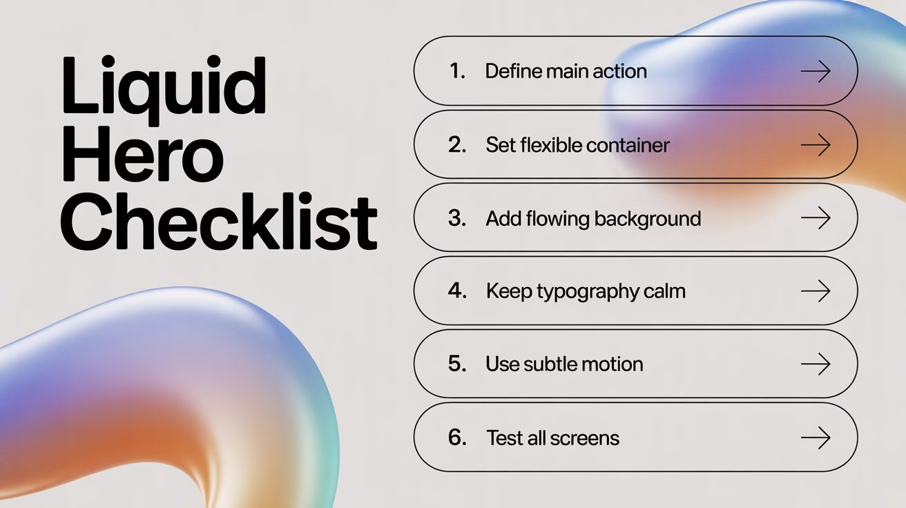
Use this simple checklist when you design a liquid-style hero for any page.
- Define one clear action: Decide what this hero should do first. Choose a single action such as “Book a demo”, “Read the guide”, or “Start free trial” and write a short, direct button label around it.
- Set a flexible container: Use a full-width section with generous padding that still respects content width. Let the background stretch edge-to-edge while the text block and button sit inside a max-width container.
- Add a soft, flowing background: Apply a gradient that shifts gently between two or three brand colours. Introduce one wavy shape or blob behind the content so the eye follows a smooth curve instead of a hard rectangle.
- Keep typography calm and clear: Choose a bold but readable heading, a short supporting line, and one call-to-action. Maintain a strong contrast between text and background so the hero looks modern yet remains comfortable to read.
- Introduce subtle motion: Add a light hover effect on the button and a slow, minimal movement on the background shape or gradient. Keep animations short and smooth so they guide attention without distracting from the message.
- Test across screens: Check the hero on mobile, tablet, and desktop. Ensure the text stack stays tight, the main shape still frames the content, and the button remains highly visible above the fold on smaller devices.
Mistakes to Avoid with the Liquid Design Trend 2026
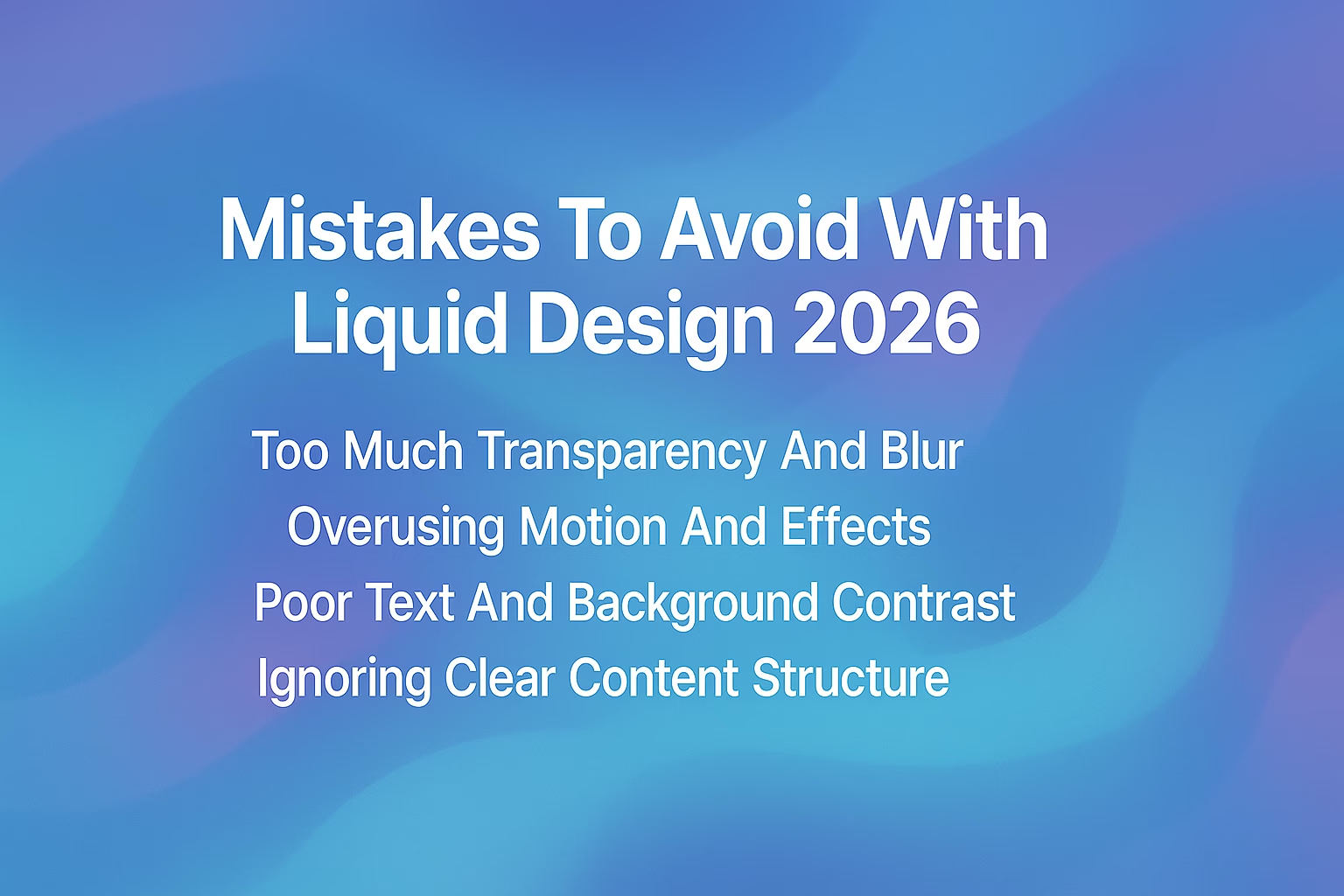
Every strong visual trend comes with risk. Glassy panels, layered gradients, and flowing shapes can quietly damage usability when they hide contrast or overload motion.
- Articles examining glassmorphism warn that too much transparency, blur, or glow can harm readability, especially for users with low vision.
- To keep the liquid design helpful instead of tiring, a few guardrails help.
- Motion works best as a guide, not a show. Trend pieces on modern interfaces highlight purposeful micro-interactions that support tasks while staying light enough for older devices.
Next, contrast deserves constant attention. Calm gradients or blurred photography can sit behind panels, yet foreground text still needs clear edges. Finally, content structure remains the anchor.
Long guides, such as Mastering Stock Market Basics: A Powerful Guide and 10 Best Products to Sell Online from Home, show how readers stay engaged when information flows logically. Liquid visuals should support that flow, not replace it.
Conclusion: Why Liquid Web Design 2026 Matters
In 2026, liquid web design feels less like a visual trick and more like a practical mindset. Layouts stretch gently between devices, shapes stay closer to nature, and motion offers feedback instead of dragging attention away. When visitors move through a page that behaves this way, the experience feels intuitive and calm, even when the subject covers complex technology, finance, or digital behaviour. Screens begin to act like soft, responsive surfaces rather than rigid grids.
For creators, founders, and storytellers, this shift opens a powerful design direction. You can pair strong content with flexible grids, soft gradients, organic shapes, and considered micro-interactions to create pages that people genuinely enjoy using.
If you plan a new site or redesign, start weaving elements of liquid web design 2026 into key sections, test how visitors respond, and let those insights guide deeper changes. The trend rewards brands that move early and design with feeling.
FAQs
What is Liquid Web Design 2026?
Liquid web design 2026 uses fluid grids, organic shapes, gradients, and connected motion so layouts adapt smoothly to different screens while staying readable, calm, and visually engaging for visitors.
How is liquid design different from standard responsive design?
Standard responsive design focuses on fitting layouts to screen sizes. Liquid design adds softer shapes, depth, and purposeful animation so that responsiveness feels more natural, expressive, and emotionally appealing.
Does liquid design always include glassmorphism?
Liquid design does not always require glassmorphism. Many interfaces rely on gradients, spacing, and simple shadows, while some mix frosted panels with plain sections to keep the experience balanced.
Can blogs use liquid design, or is it better for landing pages?
Blogs benefit when liquid elements stay focused. Flowing heroes, soft callouts, and gentle scroll transitions support reading, especially when article bodies remain clean, structured, and comfortable.
Which tools help create liquid layouts in 2026?
Designers use tools such as Figma and Framer to explore ideas, then implement layouts with CSS Grid, Flexbox, and modern website builders that support flexible, percentage-based structures.
Will Liquid Web Design slow down a website?
Liquid design stays fast when images are compressed, animations stay lightweight, and effects rely on efficient CSS instead of heavy scripts, video backgrounds, or oversized visual assets.
Do liquid layouts work with dark mode interfaces?
Liquid layouts work beautifully in dark mode. Gradients, glows, and glass-style panels often look richer on dark backgrounds, as long as contrast for text and icons remains strong.
Are organic blobs required for a liquid aesthetic?
Organic blobs help but do not define the style. Rhythm, spacing, colour transitions, and subtle motion can give a convincing liquid feel even when shapes stay simple and geometric.
Which industries benefit most from liquid web design?
Technology, wellness, fintech education, creative studios, and SaaS platforms benefit strongly because flowing layouts make complex subjects feel friendlier, less intimidating, and more approachable.
How can beginners start learning liquid web design?
Beginners can read responsive layout tutorials, follow trend articles, and experiment on one section at a time, observing how small changes in shape, spacing, and motion influence the experience.